
Say concentrate first.
Every decision started from the one thing that makes BioEra different. The label, the cap, the film and the feed all repeat the same idea in their own format, so a shopper meets it on the shelf, on a phone and on a listing before reading a single claim.
Identity
Plant-based, and it shows.
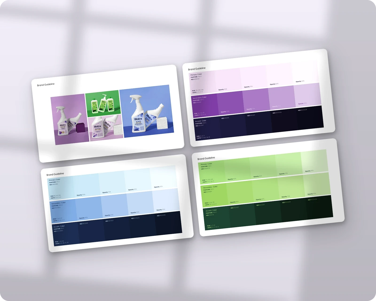
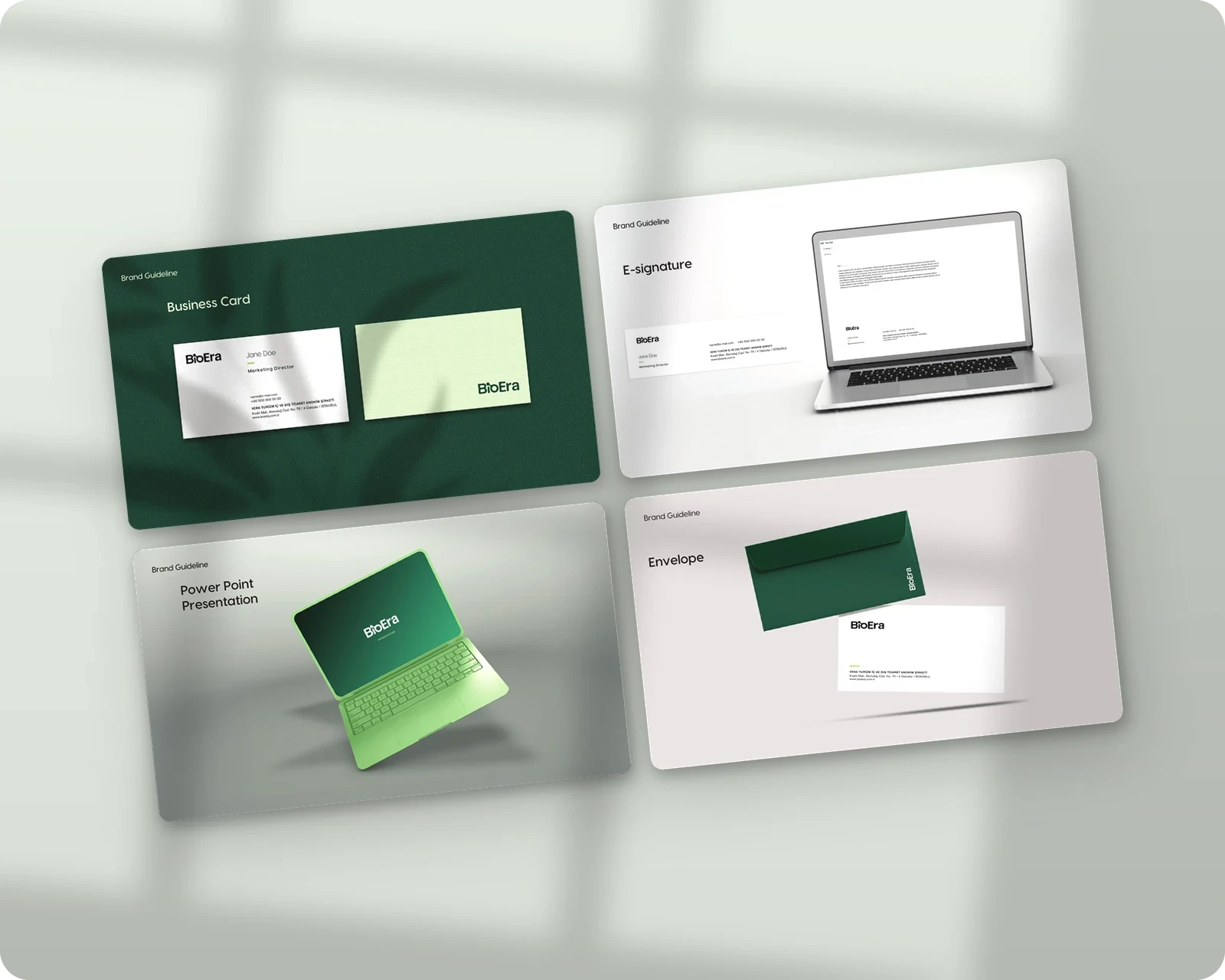
The wordmark is short and friendly, with an "i" and an "o" that later became a graphic toolkit of their own: a ring of foam, a wave of water, a protective shield. Deep green anchors the brand. Around it, each product family has its own palette, lavender for the kitchen, sky blue for laundry, pink for the bathroom and leaf green for general cleaning. Visby carries the headlines and Akzidenz-Grotesk the small print, from business cards and letterheads to the mug on the desk.


Packaging
Concentrate, explained on the shelf.
Concentrate is BioEra's biggest advantage and the hardest thing to explain in the few seconds a shopper spends at the shelf. We solved it on the bottle itself. A neck tag shows both ways to use it, straight for the strongest effect or diluted for twice the product. A small cap sticker says it before anything else: concentrate, straight or diluted. Hang tags carry the same message in the colours of each product family.

Product Groups
Five rooms, five colours.
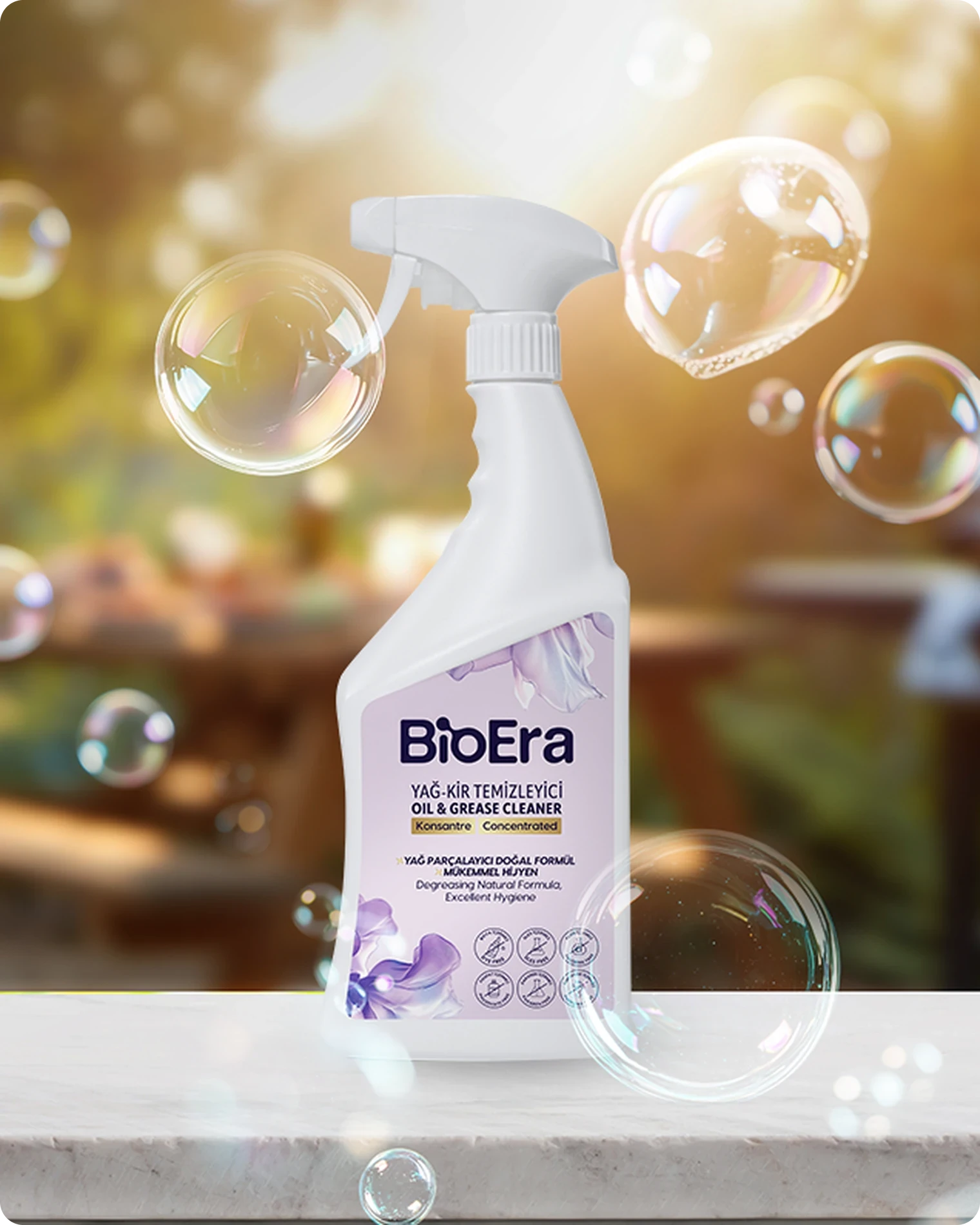
The range is organised by where it is used, not by chemistry. Kitchen, bathroom, laundry, general cleaning and stain removal each got a key visual built around its own room and its own palette, so the right bottle is easy to find on a shelf, a slider or a marketplace listing.




Content & Social
A feed with a structure.
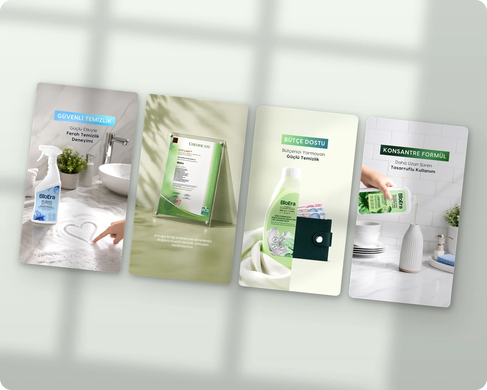
The social channels were planned as a system, not as single posts. Recurring story series each had a hashtag and a job: #Konsantre explained the maths, #TertemizYorumlar shared customer reviews, #TemizlikPekÂLÂ carried the brand line. Highlights were rebuilt into seven categories, from kitchen to marketplaces, each showing the different ways one product can be used. Seasonal posts and bundle campaigns such as "Pay less, clean more" ran on the same visual rules.



Campaigns & Creative
Every stain gets its own story.
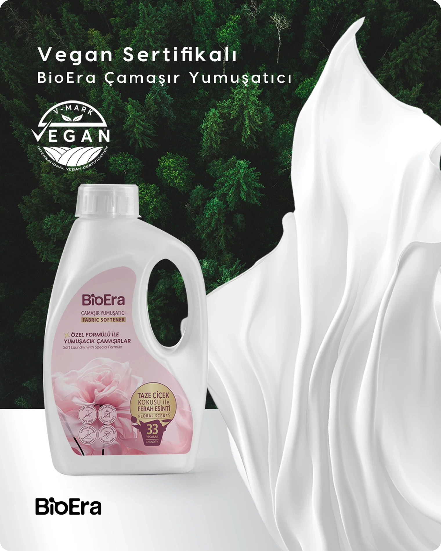
A cleaning brand can easily end up showing the same bottle on the same white counter. We started each piece from a real mess instead. A dusty rear window became "Shine me with BioEra", the opening line of the car care series. Clothes flying out of the frame announced the new liquid detergent and softener: the laundry liked it. From there every product got its own scene. A shirt spins in clear water, a burnt pan turns clean down the middle, a stain grins on a white sheet, a softener bottle stands in a field of roses. The #TemizlikPekÂLÂ nature series and the 3-for-2 spring campaign carried the same tone into the feed and the banners.




Web Design
Ready to launch.
We designed bioera.com.tr as a shop first. The home page opens on a campaign slider, the product families come next as four clear doors, and new products and bundles sit right below. The design is complete and waiting for launch.

Film & Motion
Twenty films from one kit.
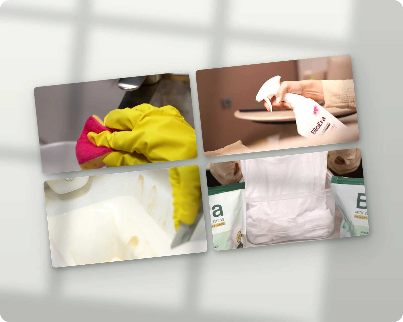
From one product shoot we edited and animated twenty ad films: five products, each in a master and a creative cut, in Turkish and English, horizontal and vertical. The "A to Z of BioEra" reel brings the whole range into one opening film, and short loops such as "one bottle, the power of three" make the concentrate story work in a few seconds of feed.



One brand, everywhere it is sold.
In a year BioEra went from a set of bottles to a brand with its own identity, a packaging language, twenty films and a feed with a structure. The same system now runs from the label on the shelf to the last frame of a film.


